Concept and Inspirations
During my research, I found a few tutorials on creating a Game Loading Screen UI and this stood out to me as something I was very interested in. Therefore, I took it upon myself to explore game UI such as loading screens and main menus.
I had a visual idea in my head of a fantasy/ adventure style game menu with a flat/2D/ illustrative game style as typically used in Japanese games such as The Journey and The Pathless.
Here are some of the visual/ game art style inspirations that I have found.
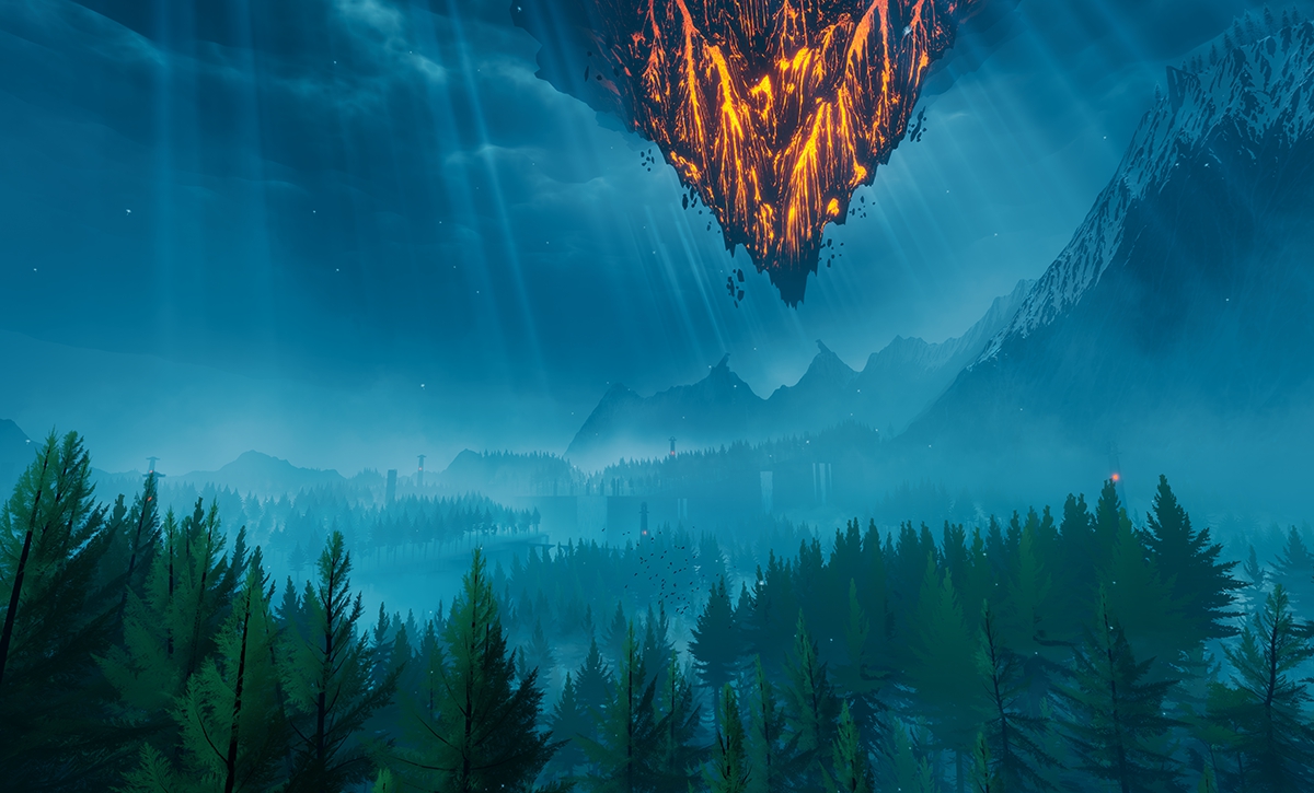
The Pathless
The Pathless is a solo player adventure game that consists of a beautifully stylized graphic art style. It is both realistic yet stylized so the art style is very aesthetically pleasing and impressive. This makes this game attractive to play. The bold and complementary color palette also adds to the impact of the artistic style.
Pathless is created by Giant Squid Studios which creates beautiful games with this stylized aesthetic.
https://giantsquidstudios.com/
“We believe that video games can be more than a pastime – they can be an artistic medium that delivers beautiful, meaningful, and timeless experiences to a wide range of people. Our goal is to create games that fulfill that potential. We strive to create innovative and deeply moving experiences that will inspire players, challenge convention, and push the boundaries of interactive entertainment to new exciting areas.” – Giant Squid Studios
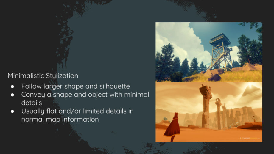
The Journey is another game I found with a similar artistic style. The Journey is a fantasy/ adventure game by Sony Entertainment and is well known for the minimalistic art style and gameplay. The game looks very soft and runs smoothly, making it very appealing to play. The color palette is very elegant and soft which creates a sense of calmness rather than chaos.
The Ori games are also examples of the artistic surreal and stylized artistic style. The bold colors and exaggerated assets make this game look like something from a fantasy and brings elements of magic to the game. Although there is a lot of depth and it has been created to look 3D this is in fact a 2D game. This game stood out to me a lot because it looks very impressive and I loved the glowing, magical aesthetic.
I found an article that explains the difference between Stylized assets vs Photorealistic assets within games. I found this useful because it allows me to define which style my own game is leaning towards, being stylized.
https://80.lv/articles/realistic-vs-stylized-technique-overview/
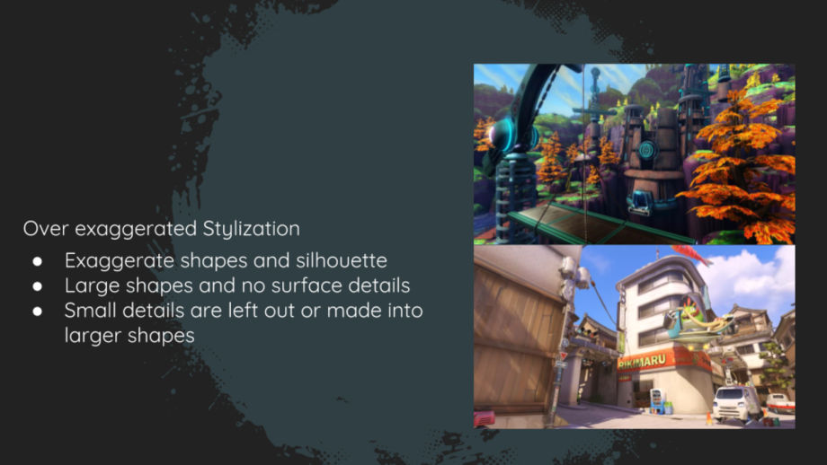
I also liked the look of the minimalistic stylization, similar to The Journey. Although it would be interesting to combine both realistic and stylized artistic styles.
“Stylized realism or semi-realism is a hybrid style of stylized and photorealistic graphics. The style is defined by having some exaggerated features found in cartoon and artistic styles, but at the same time possessing strong photorealistic elements. In three-dimensional video games, the style is often achieved by graphics designers first creating the artistic and exaggerated 3D models and animations and then rendering these models with photorealistic textures, shaders, and lighting settings.” -ANJIN ANHUT
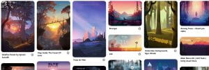
From these inspirations, I created a mood board of inspirational images I can take to influence my work. I want to incorporate my own illustration techniques into this project so I considered drawing my own using Procreate or Illustrator.
Illustrator Tutorials
I decided to watch some tutorials on Illustrator just to learn more about how to build landscapes for my own background for the main menu game UI.
In the end, I decided to use Procreate on my iPad Pro. This is because I had a better artistic ability through the different texture brushes and the touch-sensitive apple pencil. This ensured that I had more precision and control over the artwork.
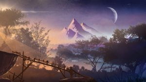
I captured the drawing process of the artwork. I used a variety of texture brushes such as trees, airbrushes, fine tips, fabric textures, etc. I gathered inspiration from my mood board to draw this.
Game Main Menu Typical Features
- Loading screen or animation
- “Press x to start”
- Story mode/ New Game/ Begin/ Start/ Load Game
- Options/ Settings
- Quit
- Character selection
- Difficulty selection
- Fade to black (game start)
Inspirations
Audio
https://filter.one/playlists/moods/sad
https://www.zapsplat.com/sound-effect-category/button-clicks/page/2/
The Process
What did I do?
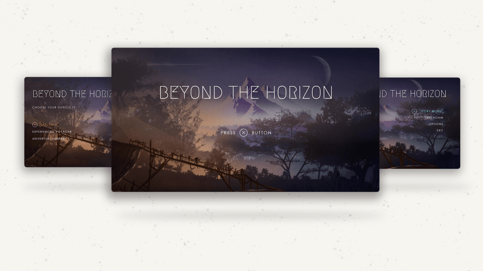
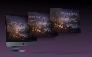
I practised using Adobe XD to create a game UI menu. I found some artwork from Pinterest which would be similar to my style. This was just some experimentation on how to use the tools to make it look like a functional game. I liked the Megrim font as it looked very modern and indie. The Nordic/ Scandanavian aesthetic was given off through the use of this font which complimented the outdoor/ adventure theme and stylised artistic style. I also used this as a way to practice the transition between options and how to animate colour.
What did I do?
In this video, you can see the process for creating a parallax effect in XD. I exported the artwork in Procreate as different png files per layer, then in Photoshop I pieced them together and imported the Photoshop file into Adobe XD. The layers were then already separated and I could move each layer easily.
What did I do?
- Created the concept artwork in Procreate on my iPad using a variety of brushes and gathered inspiration from the Pinterest mood board
- Separated each layer and exported it as png files
- Imported them into Photoshop and lined them all up
- Edited the image in Photoshop and created a vignette effect
- Imported the Photoshop file into XD
- Created a Parallax effect
- Designed the Menu UI, creating icons and loading screens, options, etc
- Auto Animate transitions for position, colour and opacity
- Created the prototype and linked it to a PS5 controller
- Used the controller and recorded the prototype
- Imported the video into Premiere Pro
- Added audio and sound effects
- Added transitions and exported the video
Final Product
What did I enjoy/ What are my strengths?
For this project, I would say my favourite aspects include the digital painting in Procreate, then using Adobe XD to animate the parallax effect. This was my first attempt at creating a parallax effect and I found it very enjoyable and found that I gained a deeper level of satisfaction from using the console remote to control the prototype. My strengths include coming up with the general aesthetic and bringing it to life with sound and moving/ interactive visuals.
What did I find challenging/ What are my weaknesses?
Surprisingly, I found this project rather easy and I didn’t really struggle much as the whole process ran rather smoothly. One thing I did find quite challenging was when it came to putting it all together in Premiere. I wanted the title of fade so I had to recreate the intro and it took me a while to fiddle around with the alignment to make sure it was all in place and seamlessly flowed.
Future recommendations?
In the future to add depth and extra elements to make it better I would consider animating flying birds or making the mans cape fly in the wind, or even moving the trees slightly with the puppet tools.

Leave a Reply